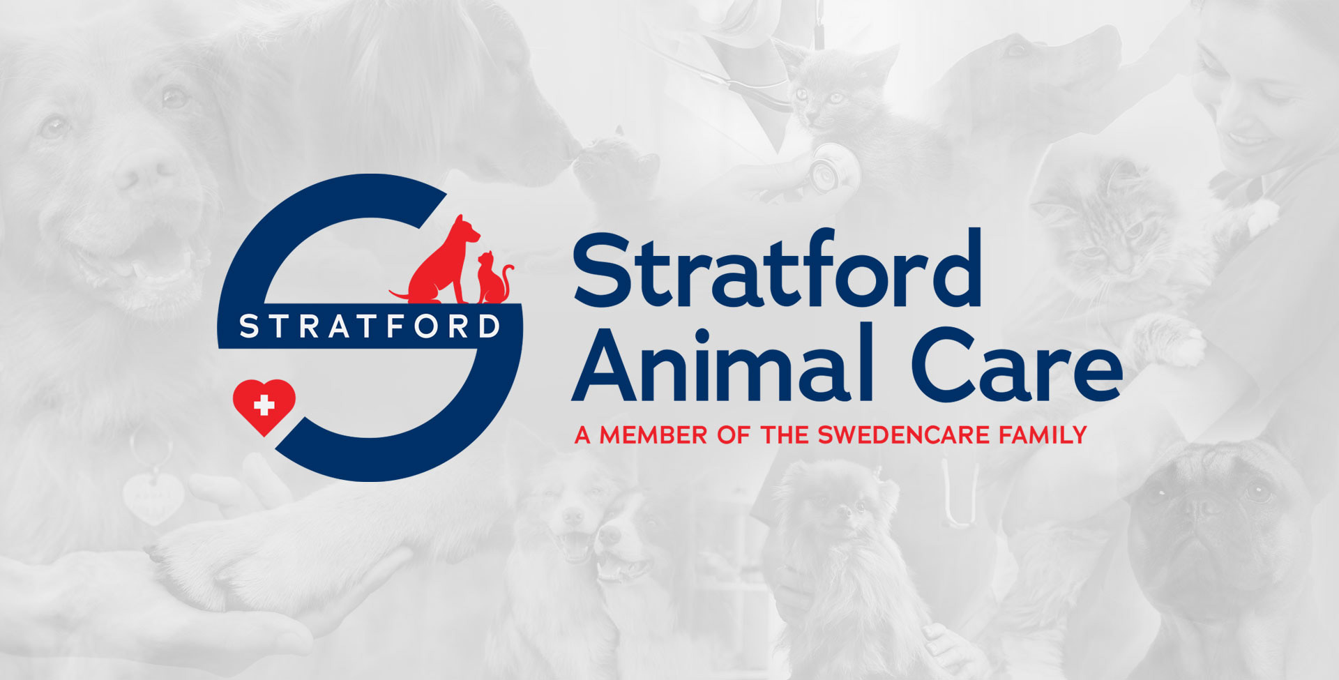
While working at Stratford Animal Care, I lead the creative team to develop a full redesign of their corporate & brand identity that could reflect an evolution of the company and a more professional look & feel that would be recognizable within the veterinary industry.
The proposal was not to completely redesign, but to evolve the old company logo that was originally designed based on the London subway visual identity and which didn't really reflect or communicated the company's mission on animal health.
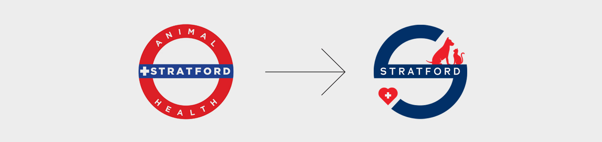
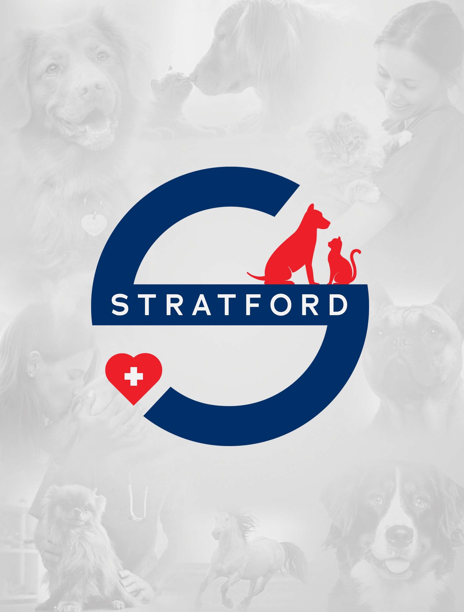
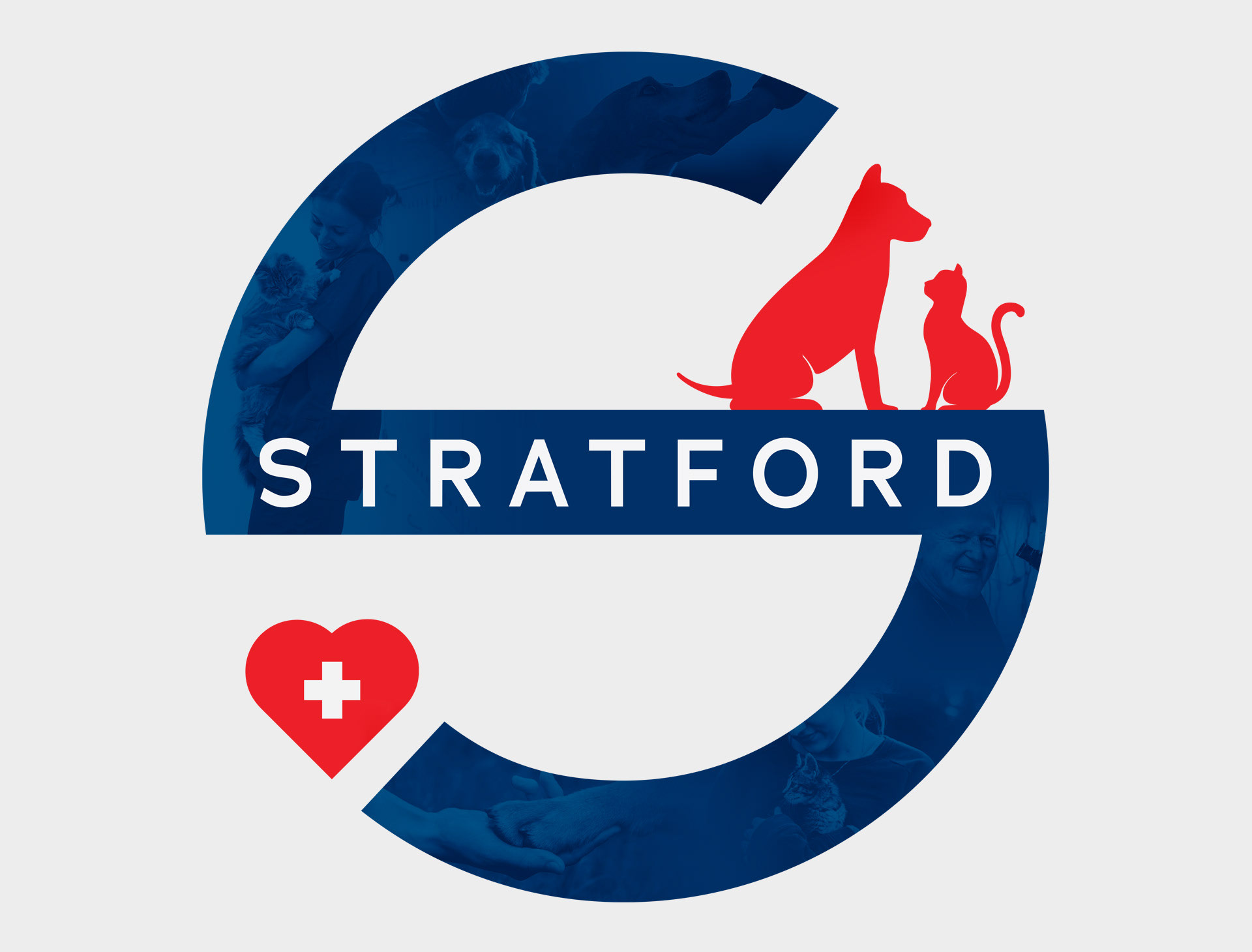
The circular logo evolution to an "S" shape, focused on only one word and incorporating elements that depict animal health at a first glance.
A variations of the of the icon was created to be utilized as a visual that reflects the company mission "Care for Pets. Solutions for Vets" as a collage within the logo.
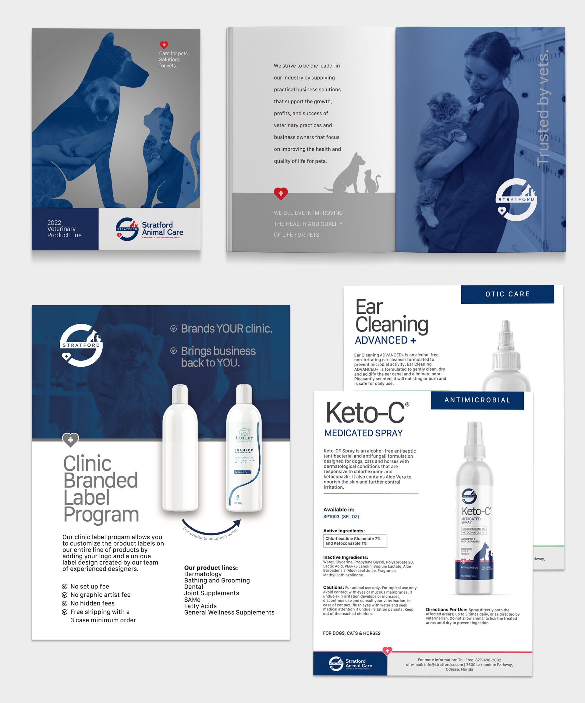
The product catalog, brochures, informational sheets and printed materials evolved to align with the updated, clean and professional aesthetic.
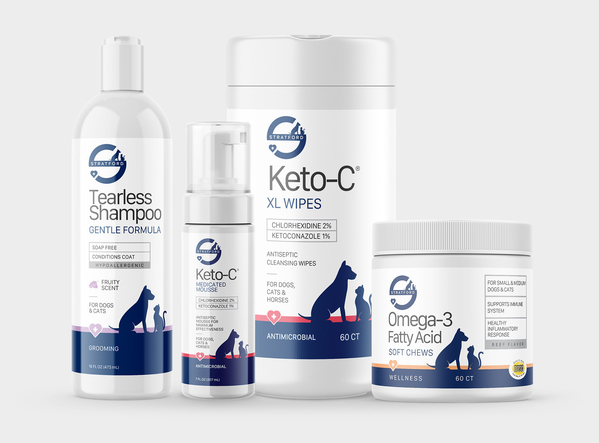
As part of the redesign, all product labels were updated with a cohesive, veterinary grade / professional grade look and feel.
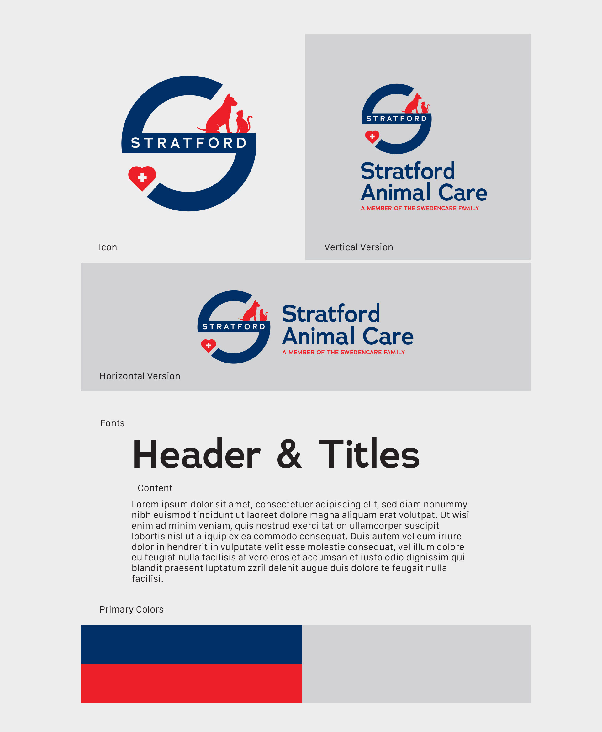
Part of the updated brand guidelines.