I was briefed to develop a new packaging design for the CBG product line extension for Forth CBD. The challenge was to keep a consistent look throughout the brand packaging, but make sure the design and graphics were different enough to showcase the CBG as a higher end and more premium product, and separate from the original CBD line.
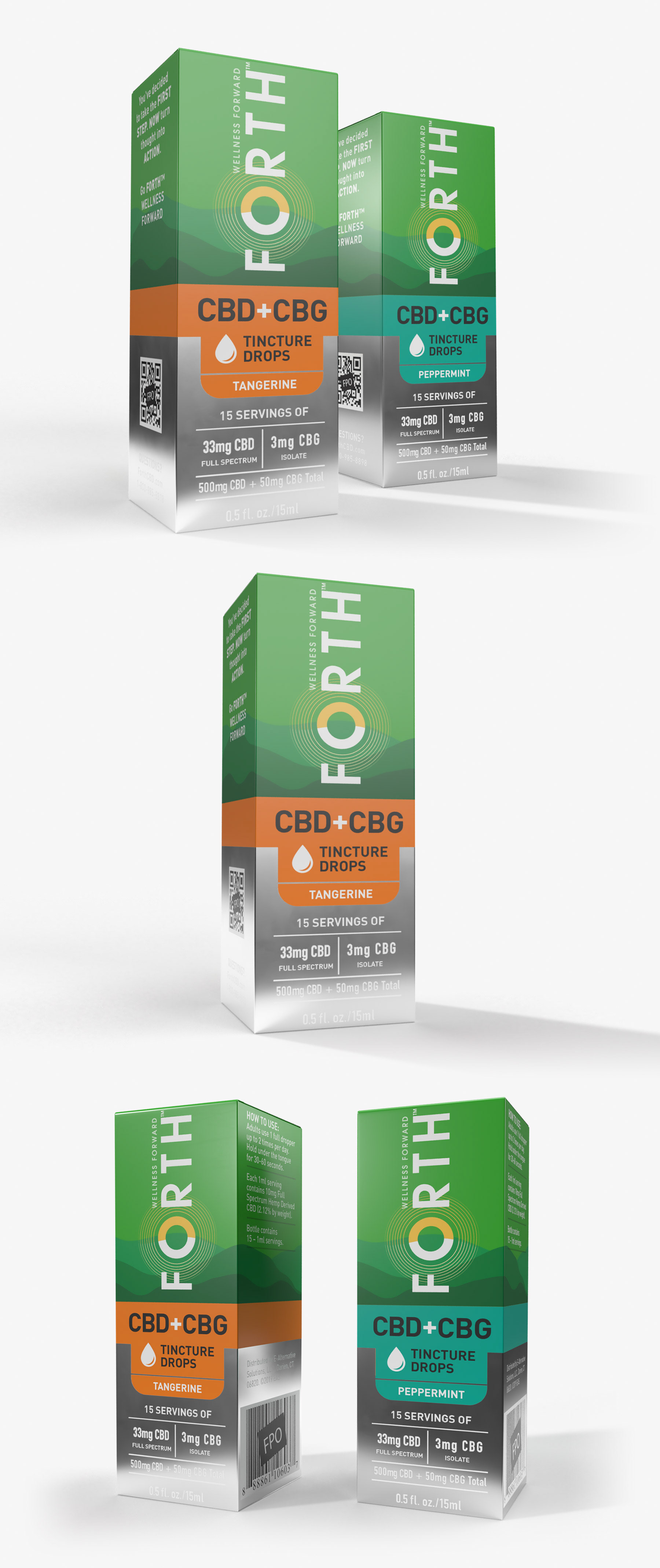
My design suggestion was to keep almost the half top of the layout unaltered from the original design and focus on the bottom, rethinking how the product flavor is showcased and improving overall the communication elements hierarchy. The bottom of the pack features a semi-reflective metallic substrate that creates a high-end product feel and also reinforces the difference from the original product line.
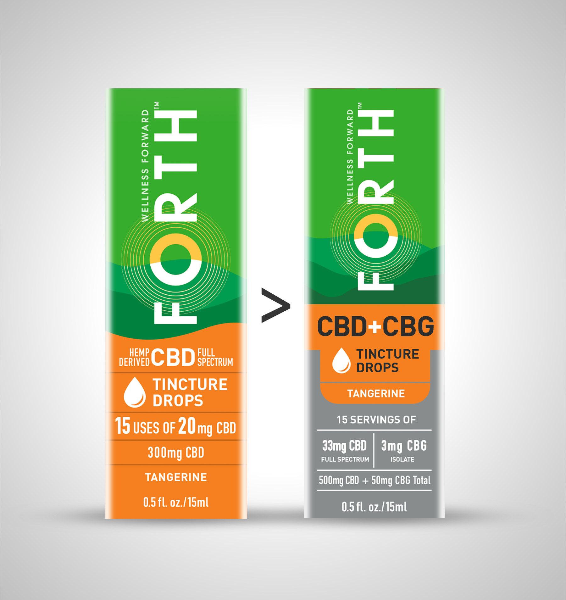
The original CBD packaging and the CBD+CBG line comparison.