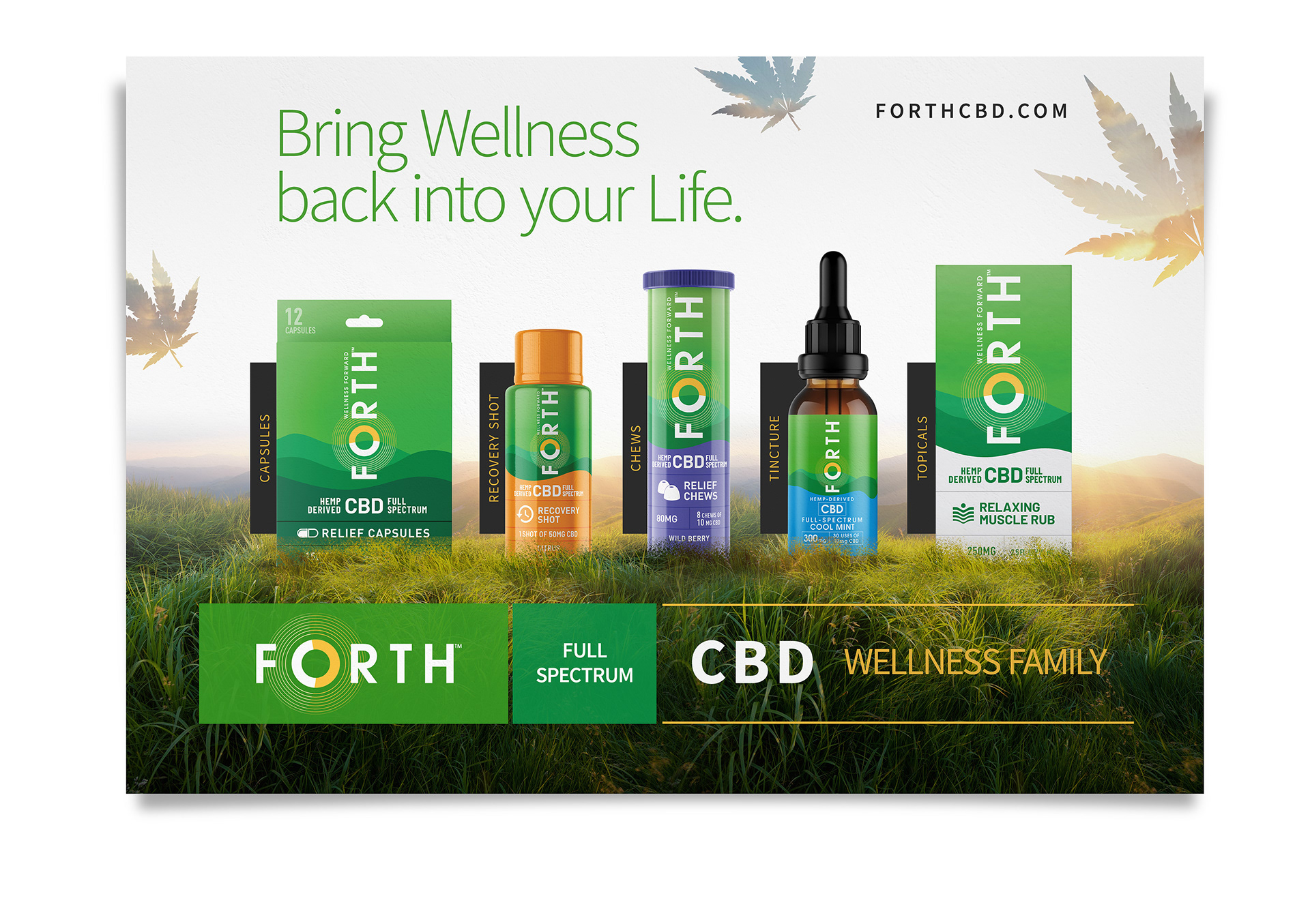
This is a concept I presented to set the graphic direction of a new cbd brand. The idea was to keep the concept product-oriented and showcase the products within a natural scenery / landscape that could tie in with the product labeling and which could emphasize the natural origin of the cbd and communicate a general sense of peace, harmony and overall, well-being.
Small details as the hemp leaves layered over with the sky texture were added to reinforce and generate interest (in a subtle way) the source of CBD.
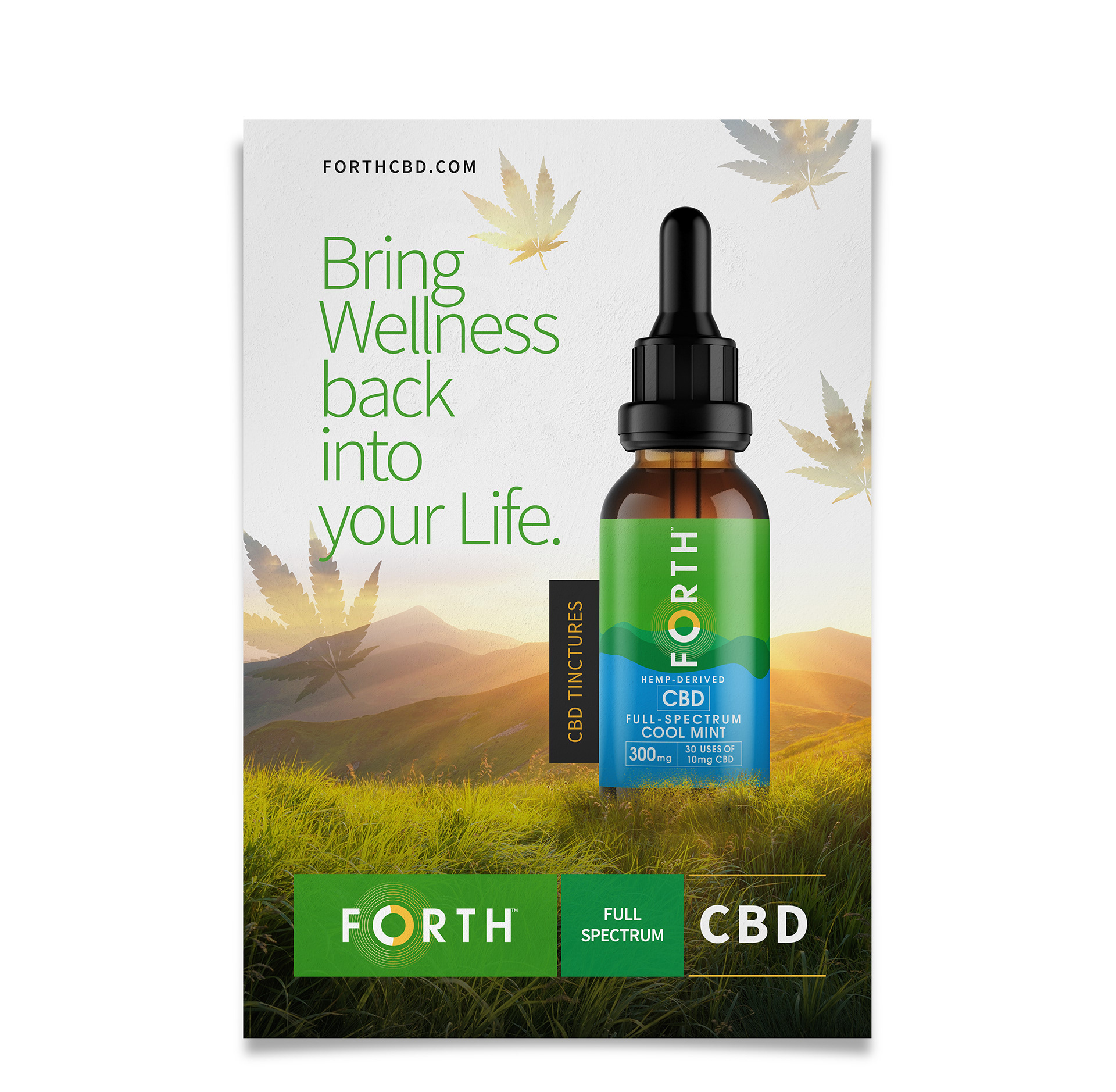
The concept was presented to be a set of single-product and product family graphics to be used both in print and digital.